____________________________________________
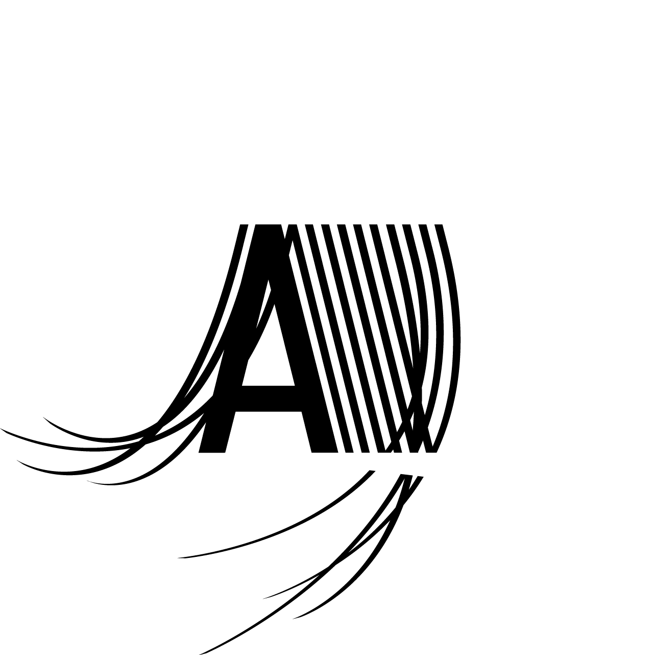
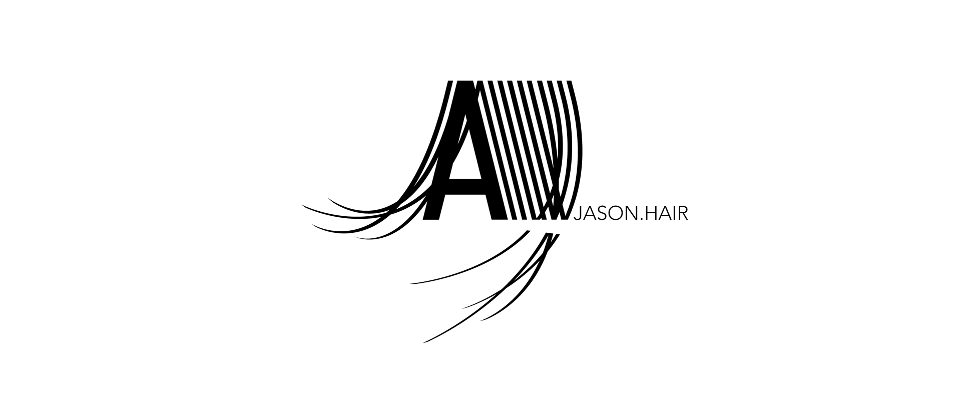
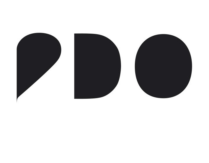
The visual identity translates hair into a graphic movement: lines become strands, rhythm becomes structure, typography becomes gesture. The logotype works with the contrast between precision and flow — a strong initial form combined with fine linear elements that suggest cutting, layering, movement and texture.
Rather than illustrating hair literally, the design abstracts its qualities: direction, density, softness and motion. The mark is bold and recognizable, yet remains light through the use of open lines and sweeping curves.
The result is a graphic sign with a strong personal character — expressive, elegant and dynamic.
Focus: logotype design, visual identity and the translation of movement, texture and personality into a clear graphic mark.
In the context of beauty, styling, individual expression and urban visual culture.