C O R P O R A T E I D E N T I T Y F O R
________________________________________________________
2 D O D E S I G N

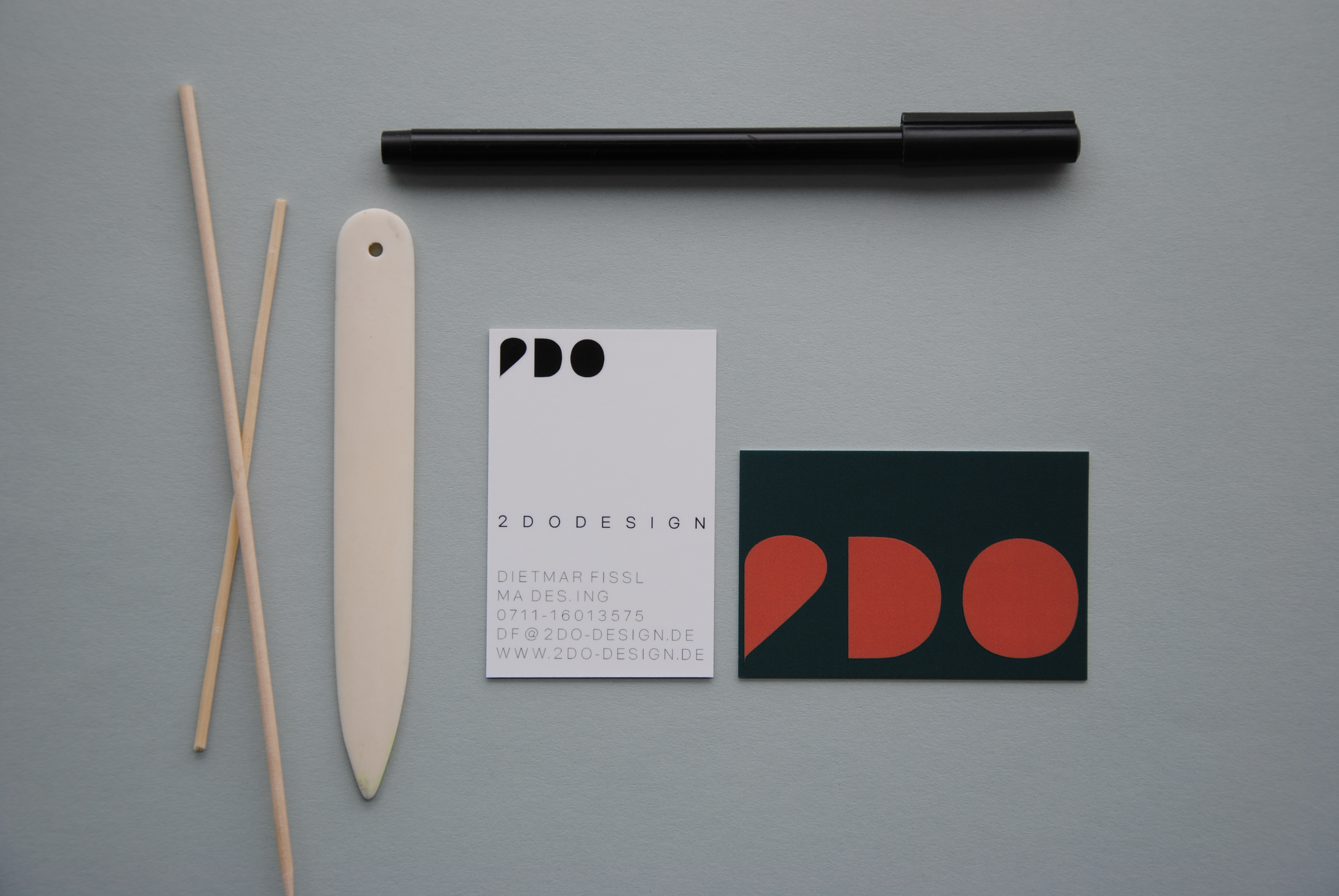


Corporate Identity for 2 D O D E S I G N
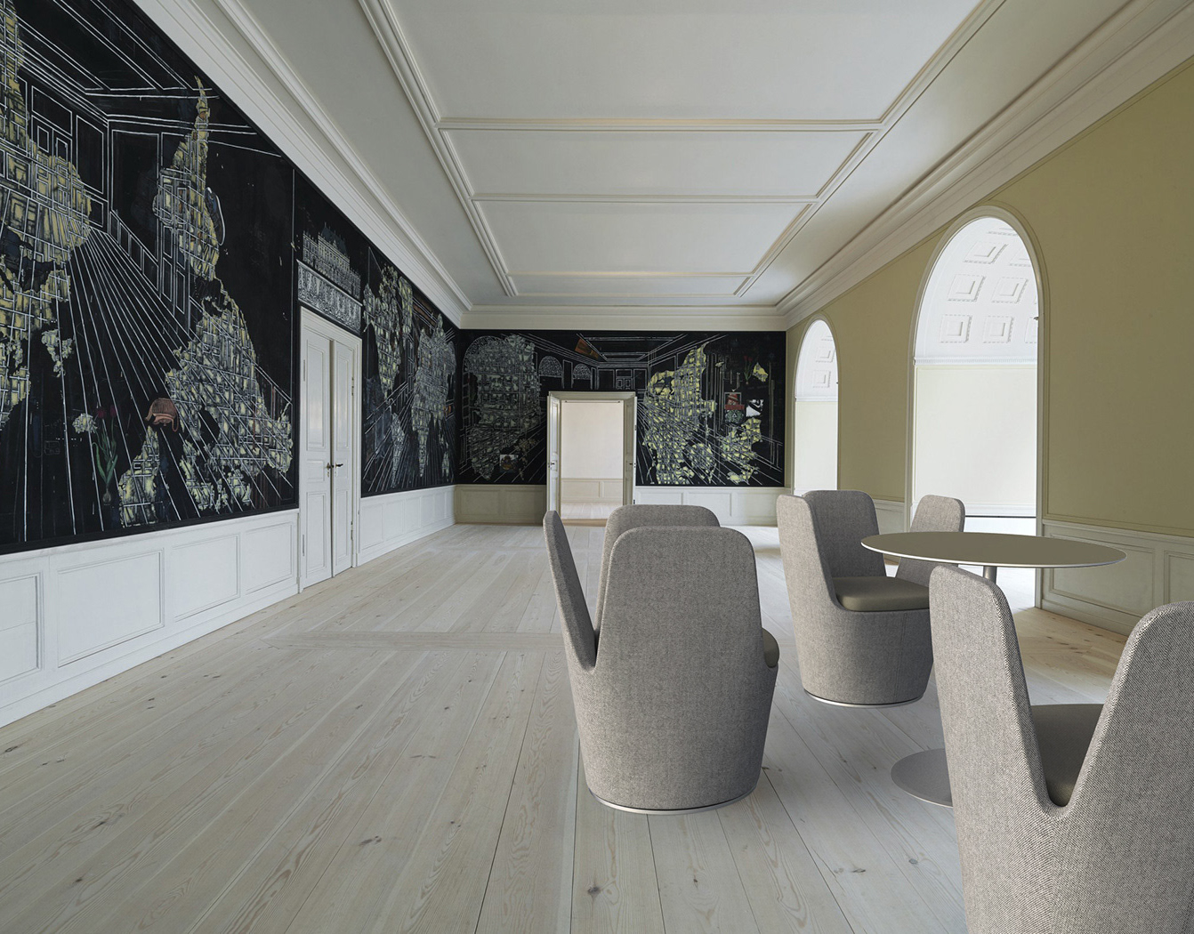
Corporate identity and logotype development for 2 D O D E S I G N, an independent design studio in Stuttgart, Germany, working in furniture and product design.
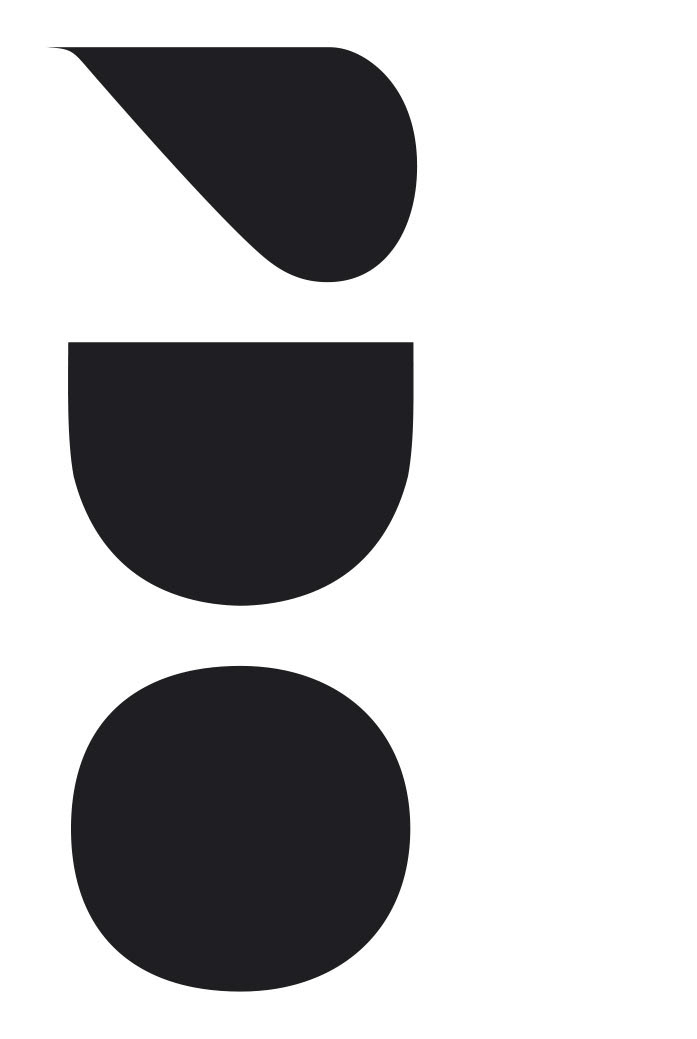
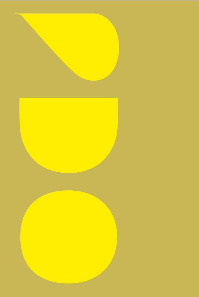
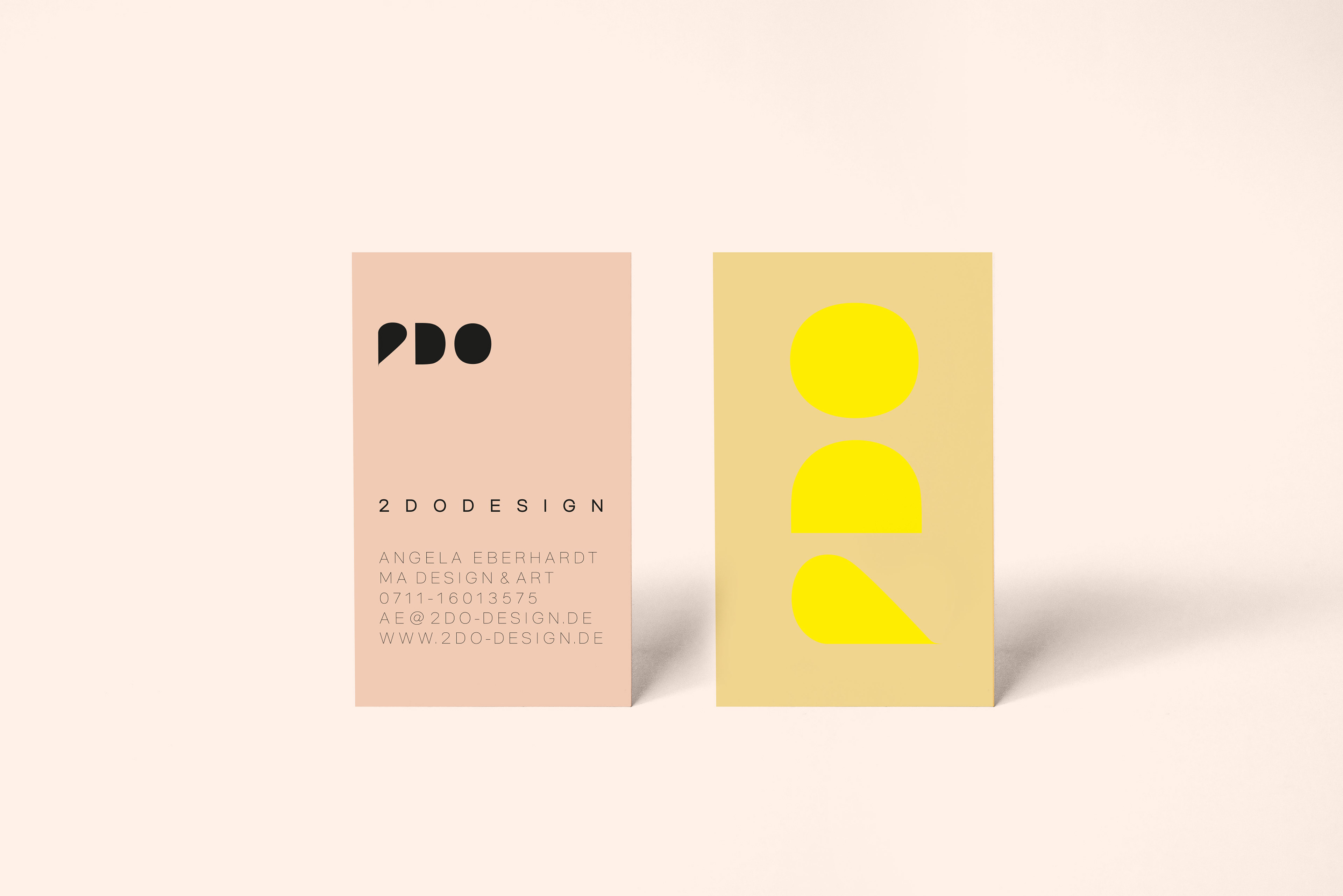
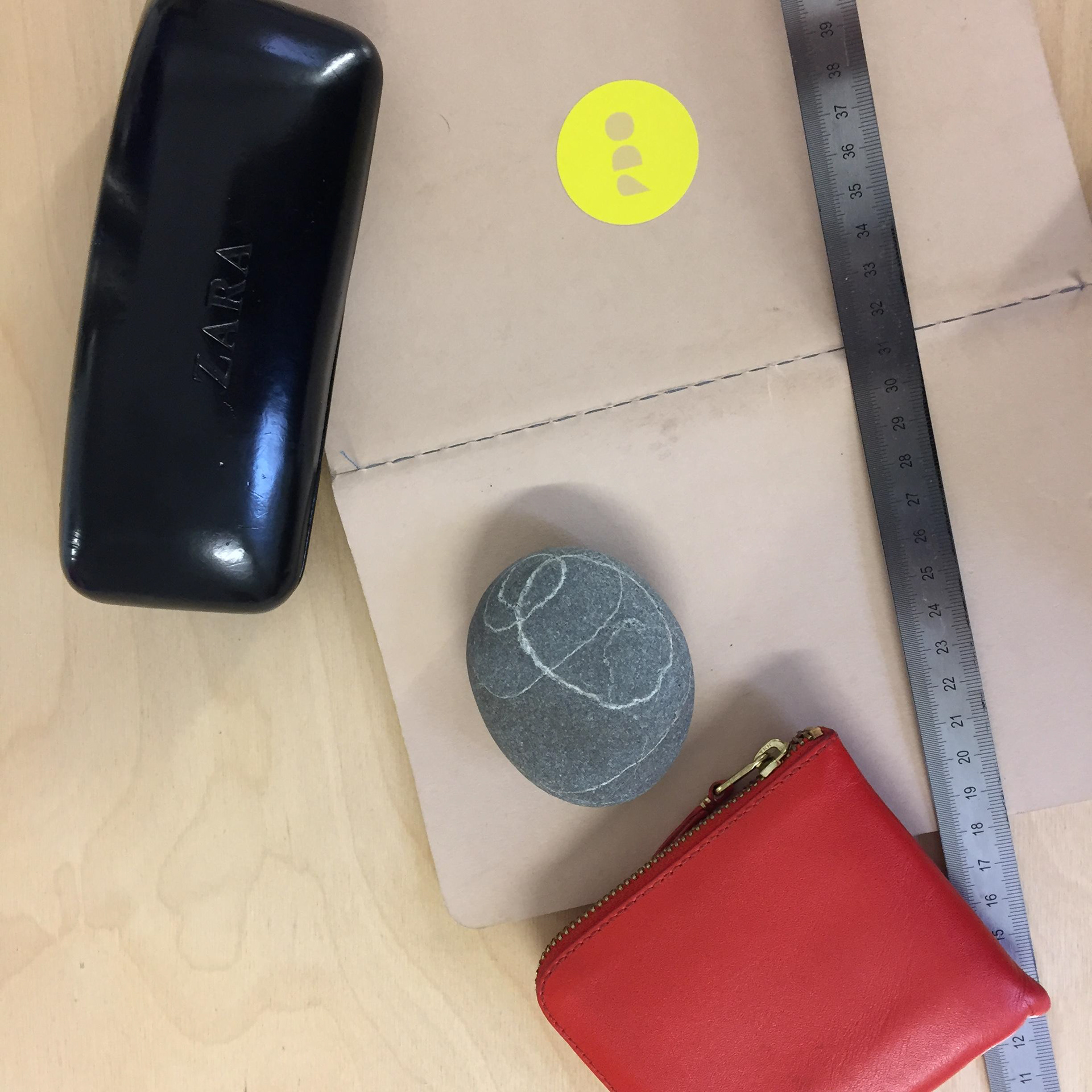
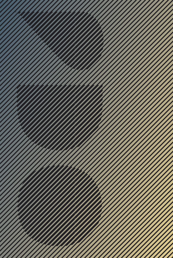
The visual identity is based on reduced geometric forms that appear simple at first glance, but are carefully balanced in proportion, spacing and curvature. This reflects a central idea of product design: good forms often look self-evident, while the process behind them is highly complex.
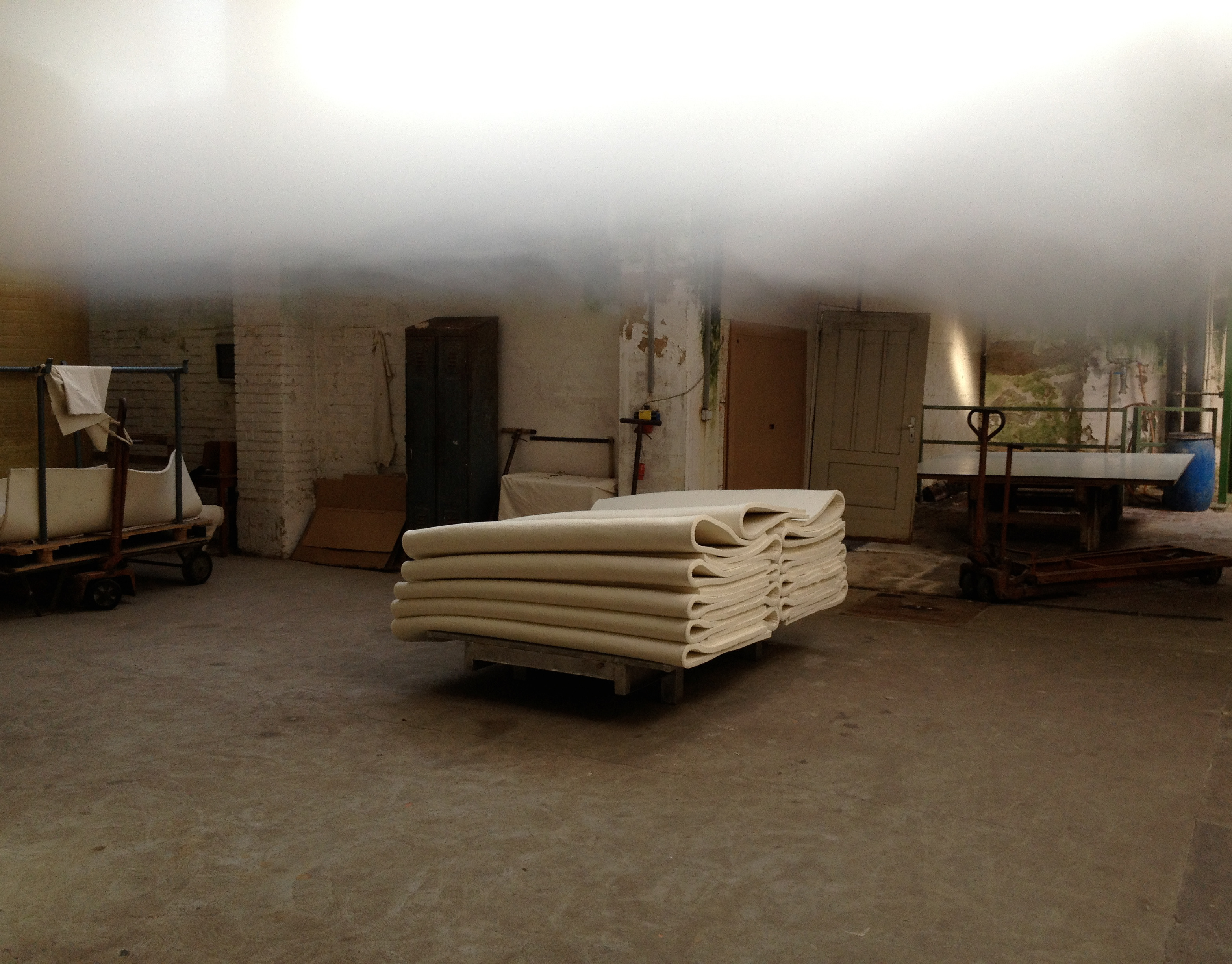
In industrial product design, shape is rarely only a matter of formal reduction. It has to respond to ergonomics, haptics, material behavior, static requirements, production logic and efficient use of resources. The identity translates this tension into a graphic system: clear, reduced and memorable, yet not purely geometric or mechanical.
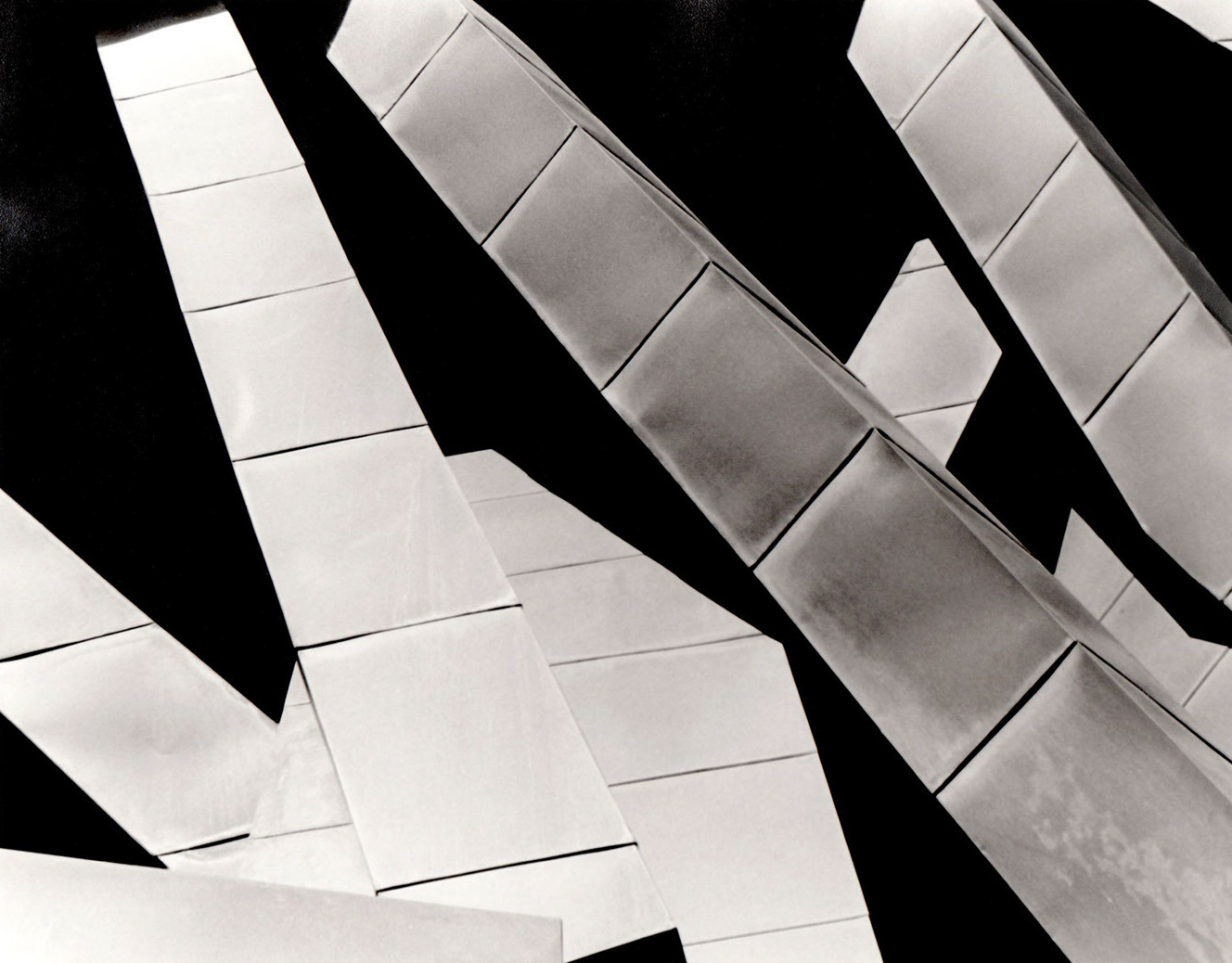
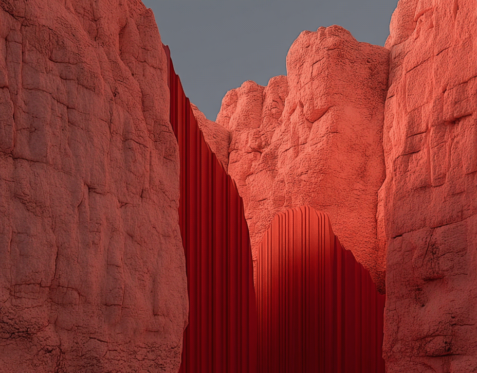
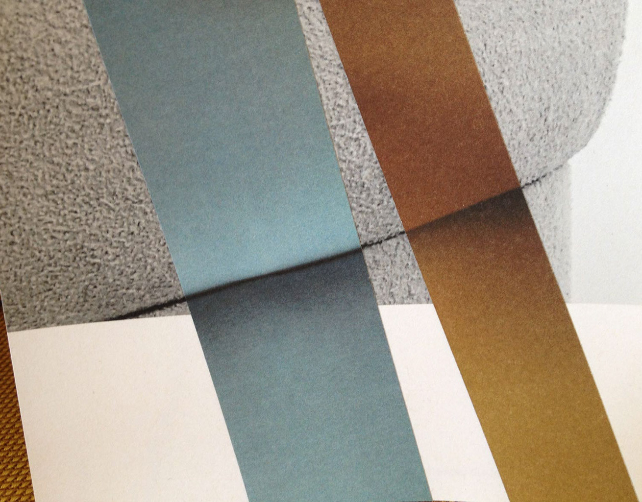
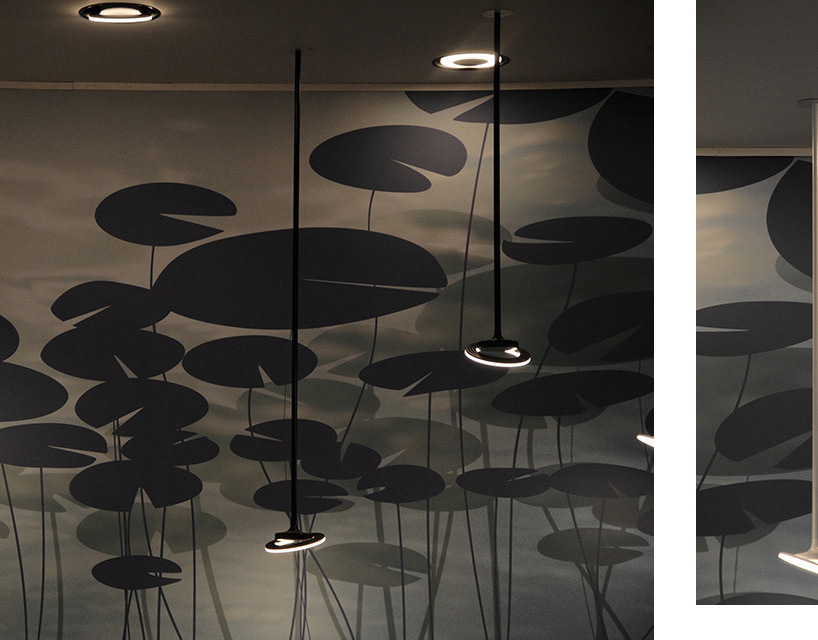
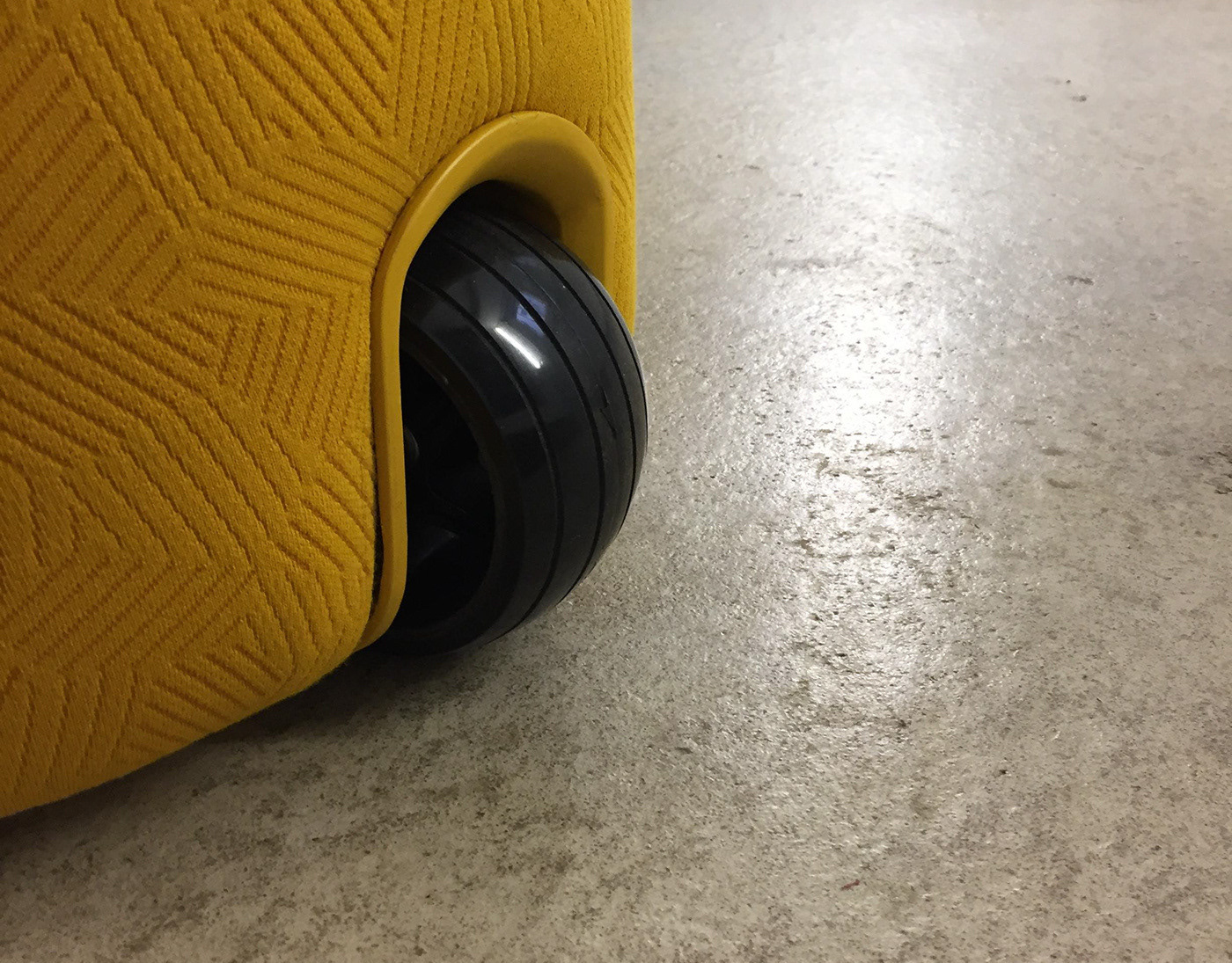
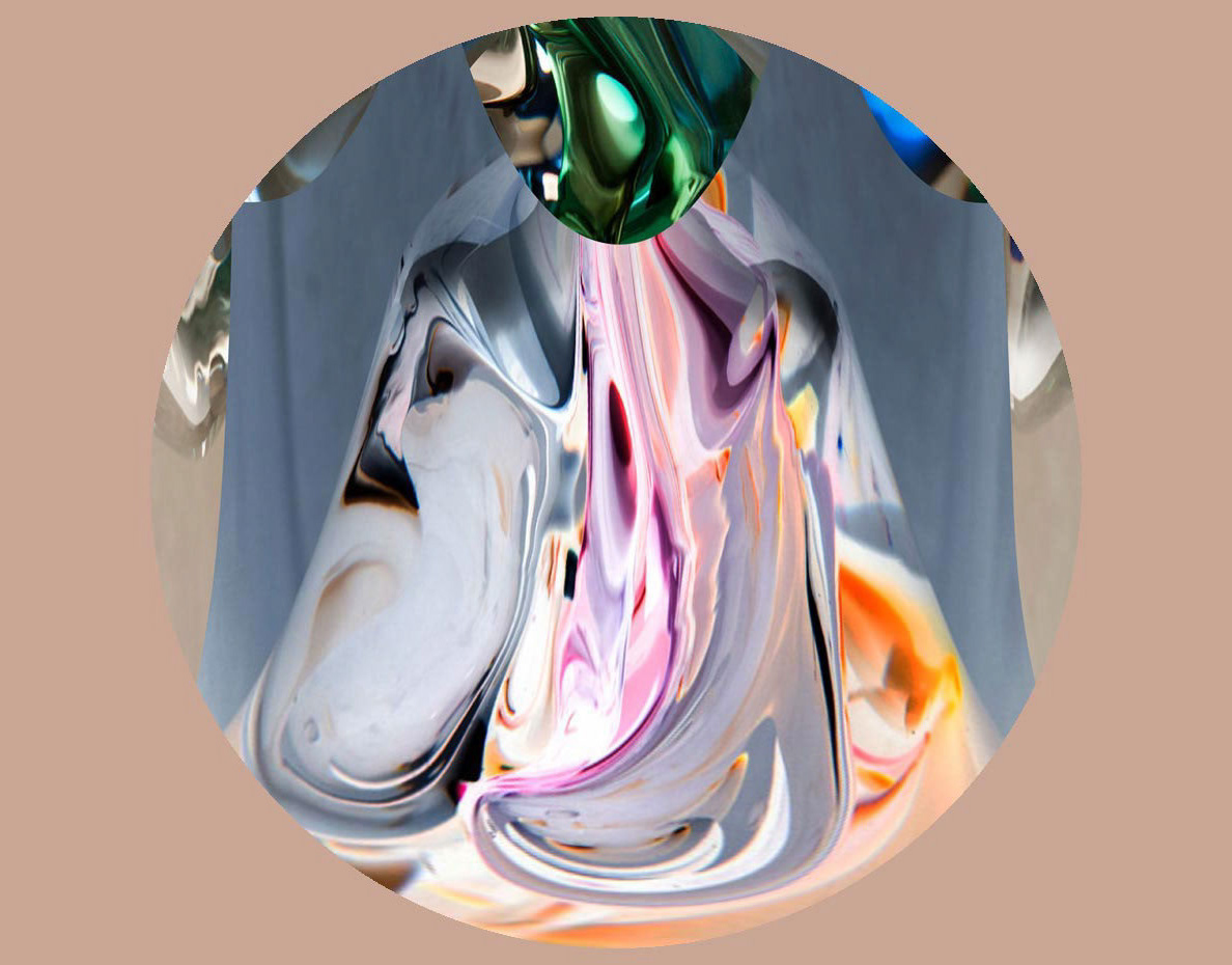
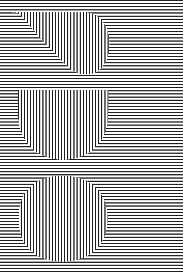
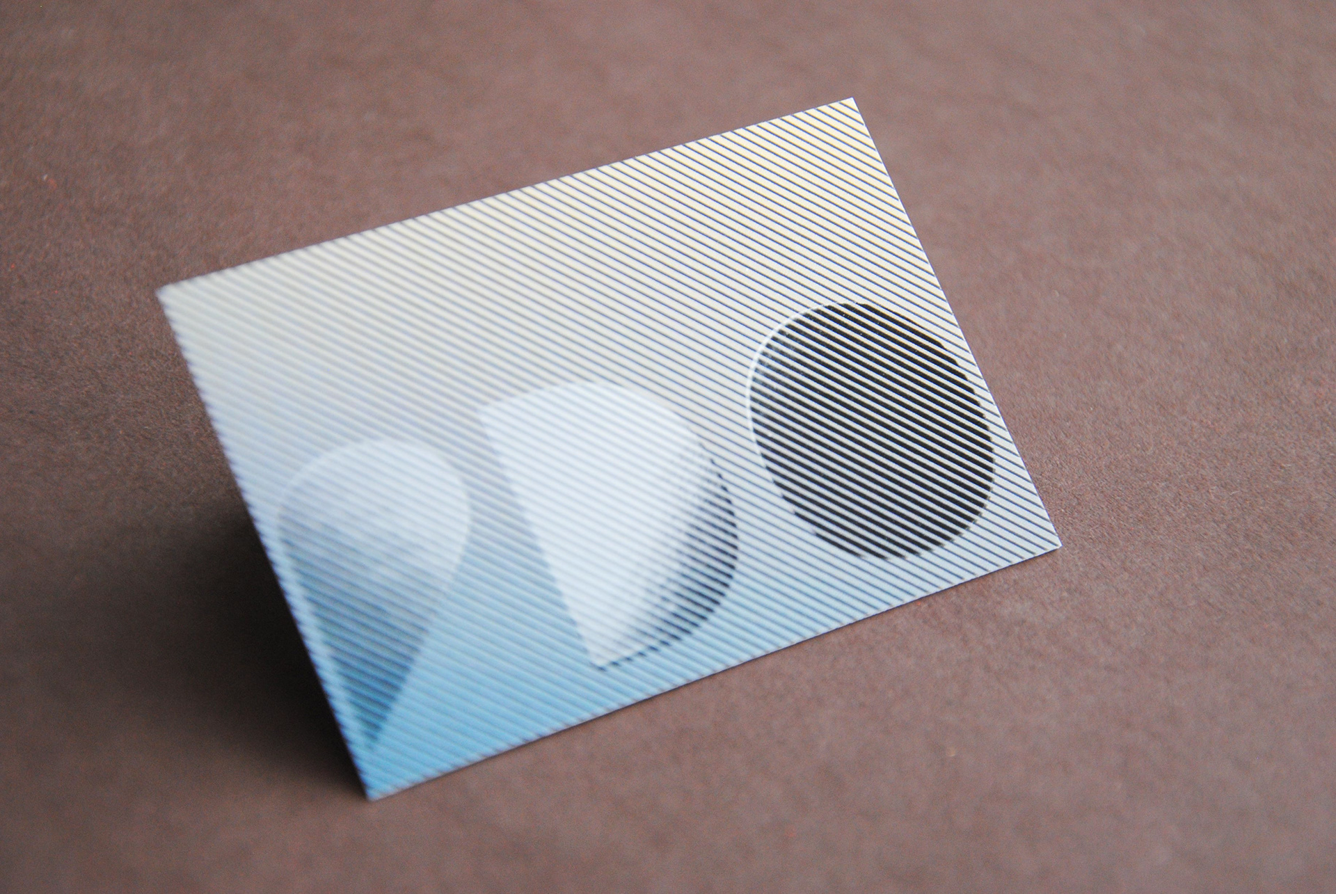
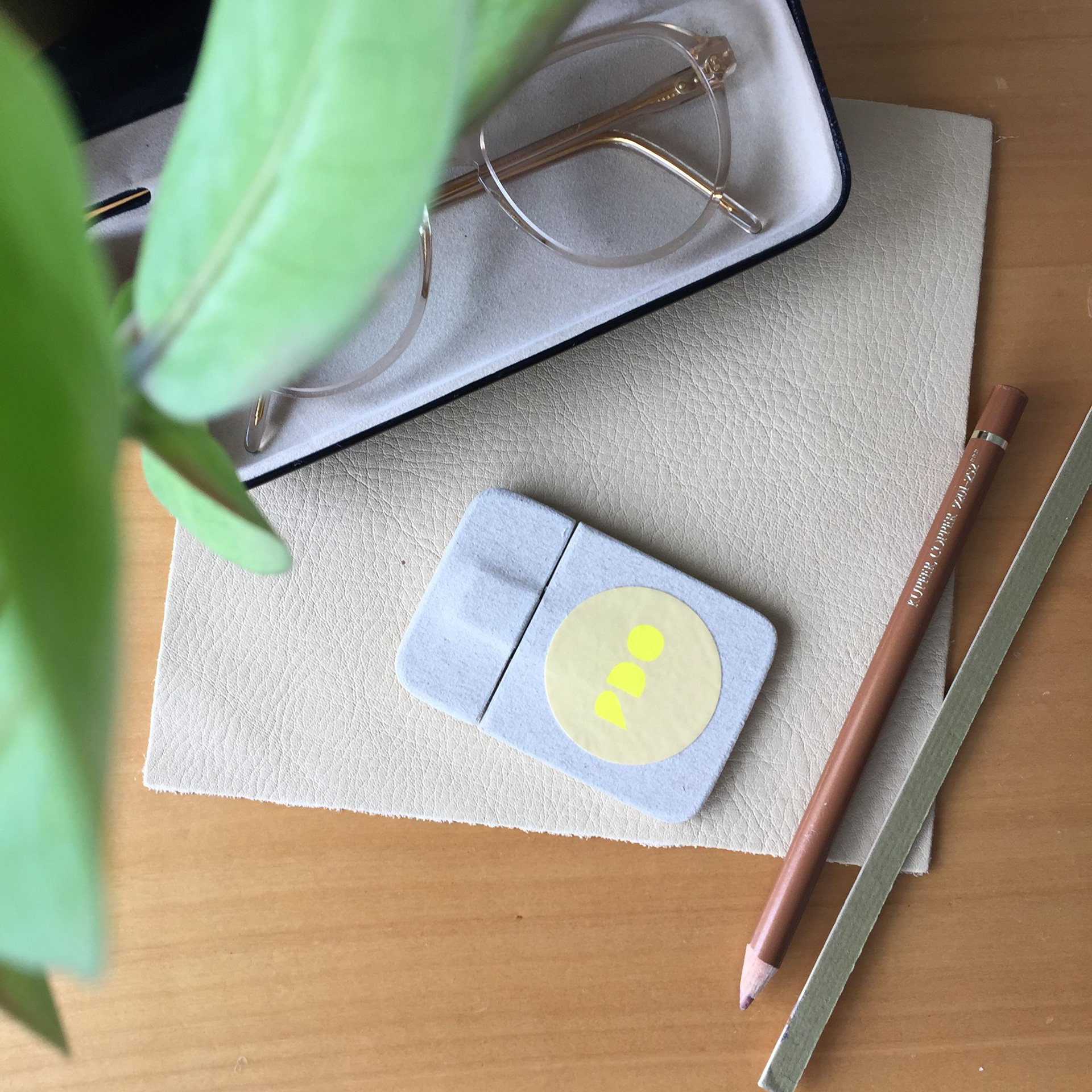
The forms refer to colors, materials, shapes, light and shadow, the essential elements of the Studios' practice. They can appear as logotype, sign, pattern or surface, creating a flexible identity between graphic clarity and material imagination.
Focus: a visual identity that communicates reduction, precision and balance — not as simplicity, but as the result of careful design thinking.